Reorganizing my Pokemon Collection Website
A Quick Background
A lifelong passion of mine has been Pokemon. It definitely started as a child watching the TV show and movies and playing the video games on my Nintendo system. I also started collecting the trading cards as a kid. My collecting habits were that of a 5th grader. I wanted cards that looked cool. I would get random packs when I saw them in stores. I kept them in an unceremonious shoe box to be forgotten for many years. In late high school, I moved into my mother's basement so my two brothers could finally have their own rooms. In my new basement bedroom, I found our humble shoebox collection, and took the time to organize it. My brothers always talked about getting a value on it to sell, but I couldn't part with it. I sat down and properly organized the cards into binders. I started properly learning about collecting and what these cards meant.
During my summer break after my first year of college, I ended up taking the cards and putting them into a large Google Sheets file. My intention was to make it easier to tell what cards I have and don't. The Google Sheets was sufficient for what I needed. As I progressed through college, I learned more about web dev and decided that was how I was going to visualize my collection. My Google Sheets became CSV files and I started programming. I spit out the most hideous spaghetti code. I used Python scripts to turn my CSV files into JSON files, then AJAX calls to refence those JSON files. I had API calls to a site I wasn't using anymore to try and pull prices. It was a proper sprint of unbridled, unplanned work and at the end of the week, I had a completed site. However, it was nearly impossible to expand on and I wasn't incredibly proud of my work. As I continued to collect cards, I continued to update my CSV files, but not my website.
Now I have met myself in the present day. With the recent quarantine, and what I've learned building this .dev website, I've decided to give my poor Pokemon Card Collection a much needed face lift. I really want to create something I'm proud of, that I can expand on, and reference easily.
Step 1 : Data Management
So the first thing I did was take a closer look at my CSV files to see what I was
working with. I had originally created a sort of relational database though my
100+ CSV files. I started with the main sets, since there's almost 90 of them, all
exactly the same set up. I have a file called setsinfo.csv that has information
on each of these sets. From there, the first column is the set name. I take the set
name, remove the spaces and change the upper to lower case, and now I have the file
name. From there I can add a file extension whether I want the CSV file, the set image
or the HTML file for the set. I have a variety of files like this for the Pop Series
Promo, Black Star Promo, and Half Deck files.
I also wrote a quick awk script to remove the last X columns from the CSV files
from when I was attempting to use API calls. I haven't used awk properly before.
I've used it in a classroom setting in a UNIX course for one week. That being said,
I can't say much stuck. Thankfully, I save all my lecture slides and was able to
reference those. My first awk scripts were messy, but I was really proud of the
fact I used awk, so I kept them around.
I made sure all the data was standard and I was ready to start turning it into HTML.
Step 2 : Building the Site
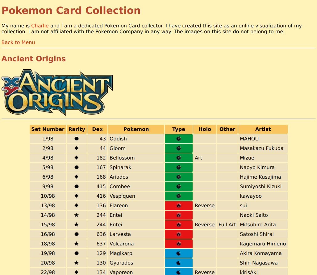
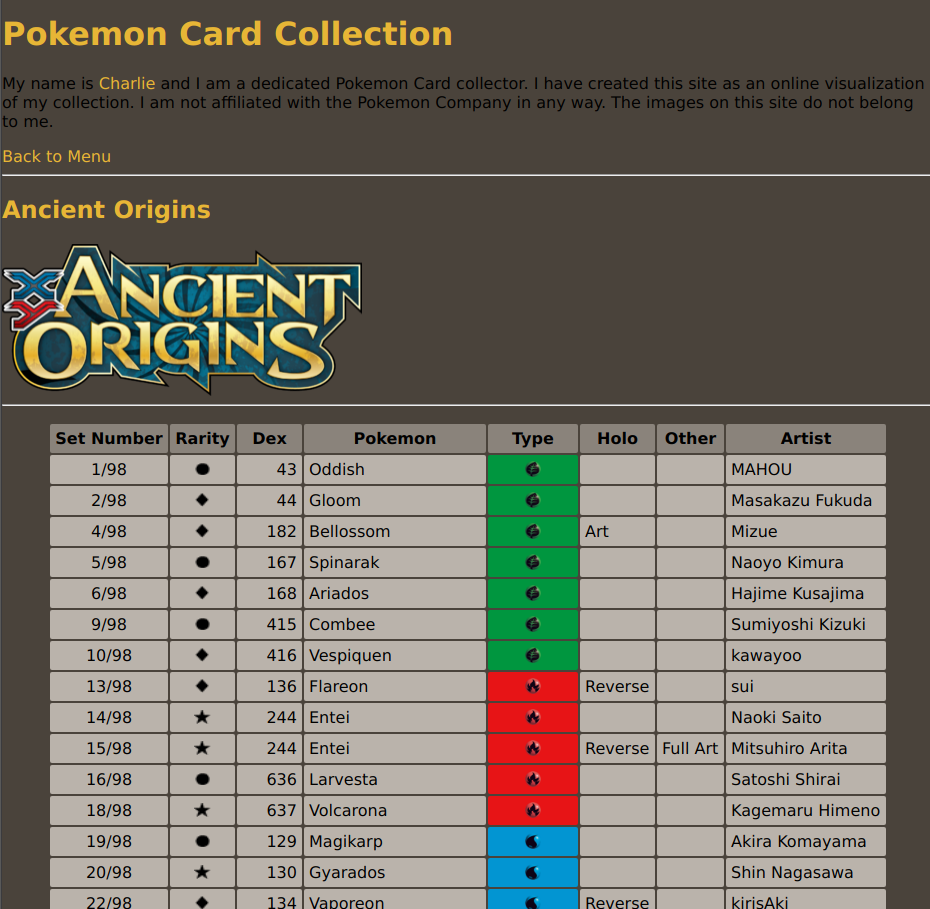
I was using HTML tables to display my cards on my old site, and I actually really liked the way I was displaying the tables. However, originally, I was using AJAX calls to grab JSON objects which I then used JavaScript functions to operate on. Since I'm going for a static page without JSON files and objects, I needed a new approach.
Once again, I'm using a bash script to build my site. I really liked this way to build my dev site and I'm really happy with the workflow and results. From here, I could use bash to dissect my CSV files and compile them into an HTML table. I realized this is a bit of a disgusting solution. I returned to awk and was able to create an incredibly simple script to turn CSV files into HTML tables. I'm really starting to love awk from this project. It's really simple and fun and efficient.
I don't think there's much more to say than that. Just a series of awk scripts being run by a bash script to create each HTML page for each set. The landing page was completed generated from the bash script. When I create the HTML page, I also append a link to said page on the menu. I have more plans for the pages to include more information. I haven't decided how I want to display that or what information I want to display yet.
I'm much happier with the structure of the site this time around.
Step 3 : Styling the Site
This is probably the most necessary and unnecessary step. Being the fancy man I am, I really need this site to be reflective of that.
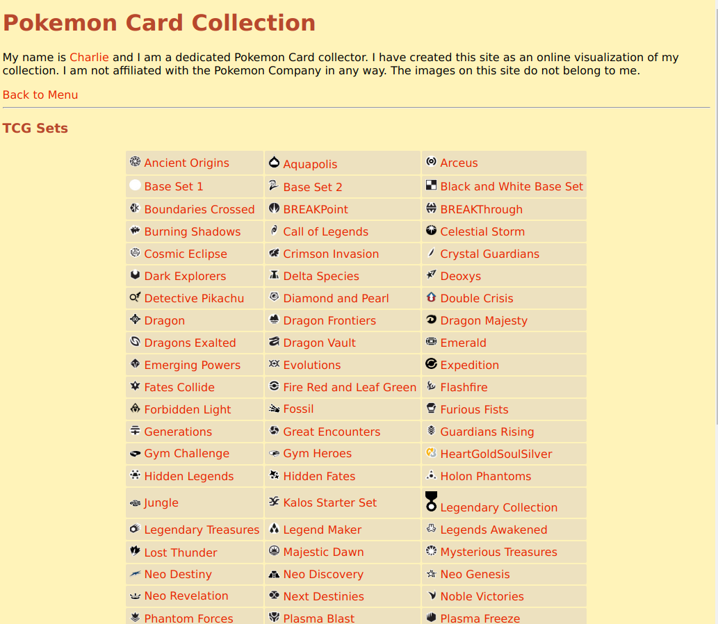
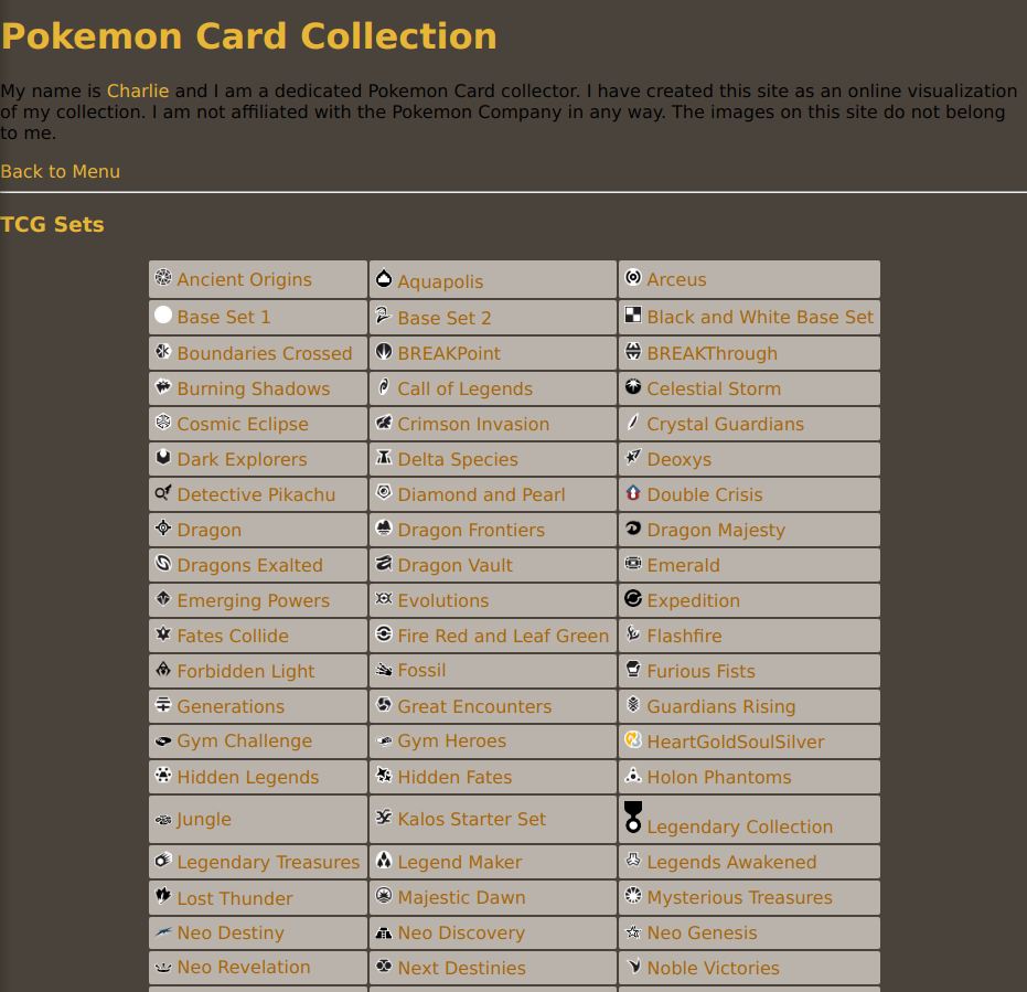
One of the first points is the menu. Originally I had the collapsing menu, but that really didn't work great on both mobile and in browser, so I figured just an HTML menu of links would be fine. I also decided to organize them in a table to make scrolling easier. I also made the genius choice to include the set image in the menu. It's super cute and it makes navigating the sets so much easier.
From there, a massive choice I had to make is the colors. I knew I wanted some form of theme relating to pokemon. I consulted a friend and he said I should go with a PokeCenter theme. I went online and grabbed an image of the PokeCenter from Diamond and Pearl and tried out a theme.
I really did not like this at all. I toyed around with the colors for a while and based on the space I had available, I wasn't able to match the PokeCenter well enough to justify using the colors. I decided to try out an Ultra Ball theme and I learned I really am just a sucker for dark themes. I'm not 100% sold on this, but I like it a lot better. I'll probably be adjusting this a bit.
Improvements
The structure of the site is by far the biggest improvement. The menu page is completely generated now, as compared to the old site where I had hard coded the menu. This will make adding new sets, which come out multiple times a year, so much easier.
In the menu, I also included the set images next to the set names. It makes the menu look cute, but also helps me in identifying sets quicker.
The menu is just a thousand times cleaner too. I had really fancy collapsing menus and stuff, but I had gotten it all off w3schools. The menu now is easier to read, and I built it entirely by myself.
I ended up going for a static website over the dynamic website I had originally. The performance is much nicer. It's much easier to style. It's much easier to debug. It's much less prone to errors.
I'm happy with what I built and I think I'm in a much better place to expand it and work off of. You can find it at pokemon.charlierose.dev
Updated 10/23/2021 : Fixing link, adding image alt text, images now link to larger versions of themselves.
Back to Top
